-
A tool to compare the GoT TV series and the GoT books
The king of all charts for serious Game of Thrones fans
By Kasia Delgado 18 May 2015The RadioTimes
For Game of Thrones fans wondering how the books and TV show differ from each other, this is a greater gift than having The Sight.
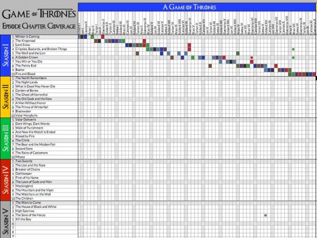
This excellent chart plots the Game of Thrones episodes against their corresponding chapters in George RR Martin’s A Song of Ice and Fire series to show how far the TV show draws from the books.
It's especially interesting now as series five of the TV show marks a serious departure from the books, whereas the first three series of the show drew far more heavily from the original story.
Apart from anything else, it makes for a very lovely looking chart of coloured dots and squares.
Here's a snapshot of the chart...

Here's how this glorious offering, made by Joeltronics, actually works.
A filled-in box means the the episode draws events directly from the chapter (this doesn't necessarily mean it covers the entire chapter)
A dotted box means the episode draws indirectly from the chapter - revealing events that occur off-page, introducing characters, minor details of an event, etc - but does not directly depict events in the chapter.
Here's the full chart with all the five series and six of Martin's books.
 Tags: GoT, Game of Thrones, HBO, D&D, George RR Martin, TV vs. books, chart
-
Comments
The BBC, Classic-novel adaptations and other related things
