-
The Americans’ set design
50 Shades of Beige
Why The Americans’ set design is far less simple than it looks.
By Sarah Archer
FX’s Cold War spy thriller The Americans, which returns Wednesday for its third season, benefits from the sort of reverse novelty that made early Mad Men so enchanting: It lets us remember (or imagine) what it was like to live in the days of phone booths, cabinet-sized computers, and TVs with rabbit-ear antennae. The Jennings’ studied suburban ordinariness makes all the intrigue of their day jobs seem even more ludicrous. Elizabeth does laundry in their harvest-gold washer and dryer; Philip serves the kids waffles. Then they strap on Colt handguns and dart off to assassinate a scheming Russian oligarch or covertly test the loyalty of an unwitting fellow KGB spy. At night, they come home from “the office” to chat about movies or baseball with the kids as if nothing unusual had happened at all.
 The set design for the Beeman home in Season 1.
Courtesy of John Mott
But making the world of The Americans look credible is trickier than it may sound.
The series began in 1981, just as Ronald Reagan took office, in the wake of the Iran hostage crisis, the Three Mile Island disaster, and the Soviet invasion of Afghanistan. The glamour of Halston had faded; Bianca Jagger was no longer lounging at Studio 54; the economy was shaky; and the electric, outré wackiness that we now associate with “1980s style” was still a few years from conquering pop culture. So the designers and set decorators tasked with conjuring this era for The Americans have faced a major challenge: the visual style of the early ’80s, its clothing and hairdos and décor, was pretty nondescript—wedged between two more clearly defined eras.
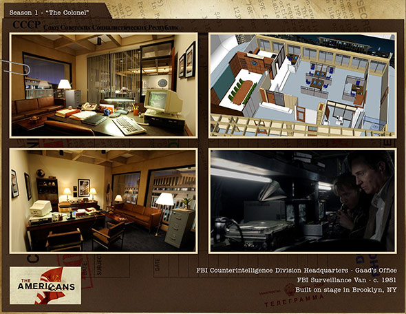
 An FBI office set from Season 1.
Courtesy of John Mott
The early 1980s are long enough ago that most modern technology didn’t exist yet recent enough that it’s not always easy to track down the “vintage” gadgets and appliances necessary to put the finishing touches on an office or a kitchen. At first glance, the era can seem deceptively similar to today, which means that designers must work to keep their own contemporary biases from creeping into the Reagan-era world of the series, or disrupting the Jennings’ special brand of stealthy normcore.
 The design for a Soviet computer lab in Season 2.
Courtesy of John Mott
Designer John Mott was responsible for developing the look and feel of the series during its first and second seasons, including the Jennings’ home, the Soviet Rezidentura, FBI headquarters, and other locations. “The Jennings’ appliances were chosen to fit in with a middle-class aesthetic,” Mott says, “not too old, not too groovy. They are spies hiding in plain sight, so it’s all about fitting in and not drawing attention to oneself.” Mott adds that the hues of the show, at least early on, lean toward the orange and browns of the late 1970s. But for the Jennings’ daughter’s bedroom, which features a cooler, more classically ’80s color palette, Mott chose a more striking wallpaper pattern, something he imagined Paige herself might have picked.
 Paige’s orange wallpaper.
Courtesy of Craig Blankenhorn/FX
 The Soviet Rezidentura, shown in Season 2.
Courtesy of John Mott
Season 3 opens just after the death of Soviet Premier Leonid Brezhnev in late 1982, as the KGB is pushing to recruit Paige as a spy. This season, the set design is in the hands of Diane Lederman, who has shifted away from the warm colors of the ’70s and toward the cooler tones of the ’80s. Like Mott, Lederman and her team have scoured thrift stores, Etsy, and eBay for vintage finds. “Ironically, it seems harder to prop and dress a show taking place in the ’80s than a show that would require a much older vintage, say the ’40s or ’50s,” Lederman said. “I often discuss this with my crew, and we are not sure if it’s that the vintage is too recent or no one is interested in this time period enough to want to trade in its wares.” Setting the scene outdoors is challenging as well: “I think part of the fun of a period show is allowing the narrative to explore a time before the world of technological instant communication,” Lederman says. “This is especially interesting when the narrative involves cloak-and-dagger drama. For instance, there are no pay phones anymore, so we carry around phone booths to all our locations. Hiding cell towers usually means relying on the help of post-production augmentation.”
 Philip and Henry at a fair in Season 2.
Courtesy of Craig Blankenhorn/FX
 Philip in a phone booth.
Courtesy of Craig Blankenhorn/FX
But if the set design of The Americans seems to be a straightforward ’80s time warp, its deeper subtext is about the complicated cultural relationship to material goods. One of the central conceits of The Americans is the nagging temptation to defect: While Elizabeth seems unshakable in her loyalty to Soviet ideals, Philip doesn’t appear to miss the USSR whatsoever. Midway through Season 2, in an episode with the very American title of “New Car,” Elizabeth chastises him for his apparent weakness in the face of commercial temptations. After buying a brand-new Camaro, Philip asks Elizabeth: “Don’t you enjoy any of this sometimes? It doesn’t make you bad at what you do. It just makes you a human being. Don’t you ever like it?” Elizabeth replies: “That’s not why I’m here. We have to live this way, for our job, for our cover. You know how I grew up. It’s nicer here, yes. It’s easier. It’s not better.”
 Philip’s new Camaro.
Courtesy of FX
The idea that “easier” is not by definition “better” is supposed to be a radical one for American audiences. This exchange between Philip and Elizabeth perfectly illustrates what both the KGB and the set designers are attempting to do by placing the Jennings in a “typical” American household: They want to reveal the real underlying rift between the two cultures that the Jennings are straddling. By our standards, Philip and Elizabeth appear to work reasonably hard for a decent life. By Soviet standards, they live in luxury. Though we don’t know the full details of their lives in the Soviet Union, snippets of dialogue and flashbacks portray a post–World War II environment of hunger, shoddy health care, and street gangs. Elizabeth and Philip had no discernible childhoods as we understand it: no new clothes, no shiny washer and dryer sets.
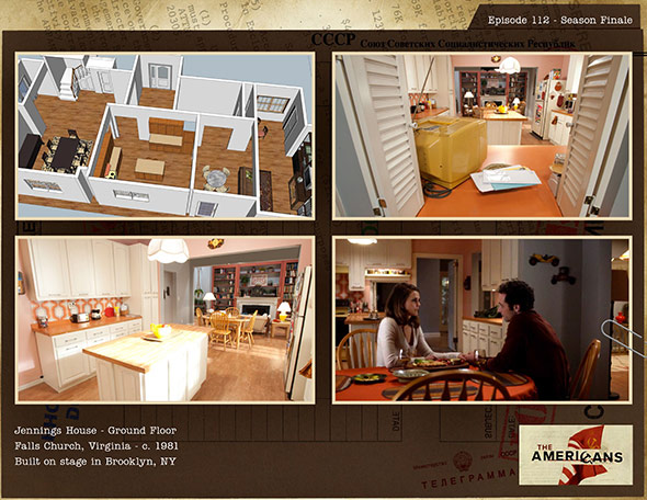
 Set design for the Jennings’ house in the Season 1 finale.
Courtesy of John Mott
Of course, this tension was a staple of the American-Soviet relationship. Take the 1959 “Kitchen Debate” between Soviet Premier Nikita Khrushchev and then–Vice President Richard Nixon, an impromptu televised debate that aired during the opening of the 1959 American National Exhibition in Moscow.* The American model home, which was presented as a house that any U.S. family could own, was packed with labor-saving domestic appliances and a color TV. If the USSR was ahead in the Space Race, Nixon’s goal that day was to prove that the American way of life was better. So The Americans uses the radical ordinariness of its domestic sets to highlight the difference between the American “way of life” and our “lifestyle.” Obsessed as we may be with technology and newness, freedom—The Americans tells us—is a necessity, not a luxury appliance.
 Tags: The Americans, FX, period piece
-
Comments
The BBC, Classic-novel adaptations and other related things
